This was a semester-long project I completed in Graphic Design II, where we dove into the branding process for a restaurant. I decided to create a restaurant with six different food cultures to satisfy everybody. I wanted to base my design of the logo, stationary, and menu items on the idea of a worldwide business.
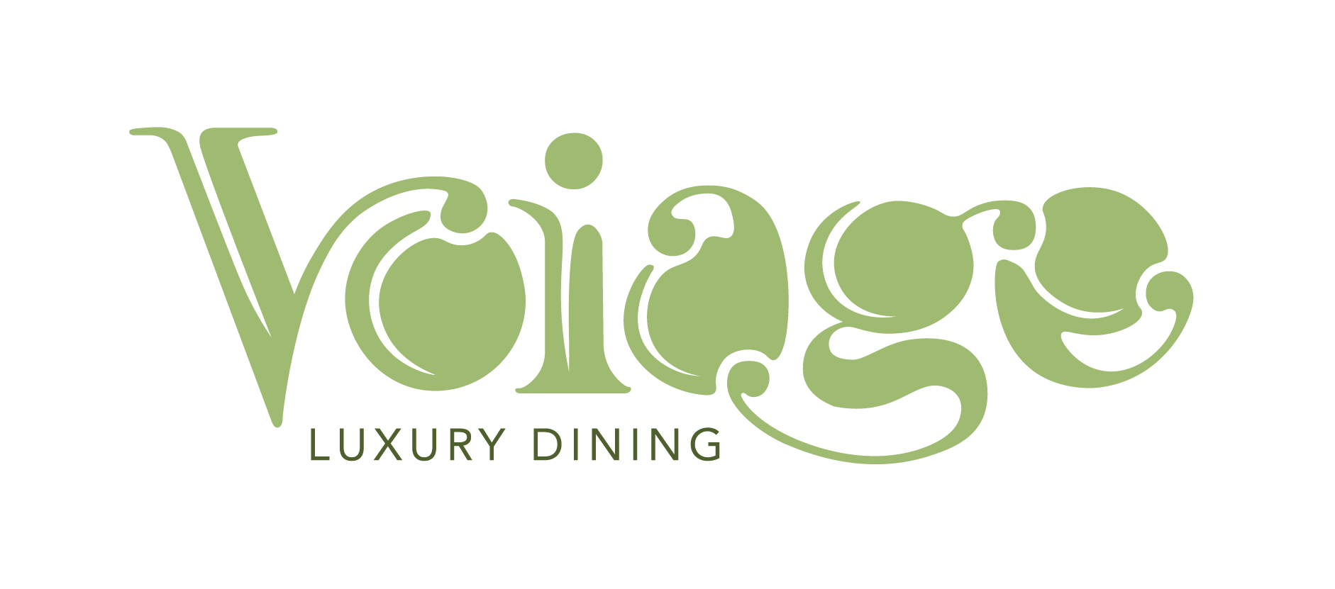
The image above shows my logo for my imaginary restaurant. "Voiage" is a play on the word "voyage," but I wanted to use a unique spelling as a hook. I liked the idea of the counters in the letters being filled and using a line as an illusion to create negative space. The curving of the "V" into the letter "o" creates fluidity and allows the viewer's eye to follow throughout the logo. This same principle applies to other letters in the logo, such as the "i" and "g." I also wanted to create a sense of unity with most of the letters making contact with the others. I added "Luxury Dining" underneath the typographic application of "Voiage" to create an immediate connection with the viewers. I enjoyed creating this logo because I could create the entire brand.

For the next part of this project, we were tasked with creating the stationery for our restaurant. I created the letterhead, that followed the same fluid line that the serifs do on the logo. I also decided to introduce silhouettes of international landmarks that can be seen on the bottom half of the letterhead. To the right of the letterhead, I have added business cards that fold over to create an exciting and interactive design. To the right of the business cards, the front and back envelopes Voiage would use. I used the same organic shape throughout the stationery and as the flap on the back of the envelopes. The front of the envelope also has silhouettes that are seen on the letterhead and business cards.
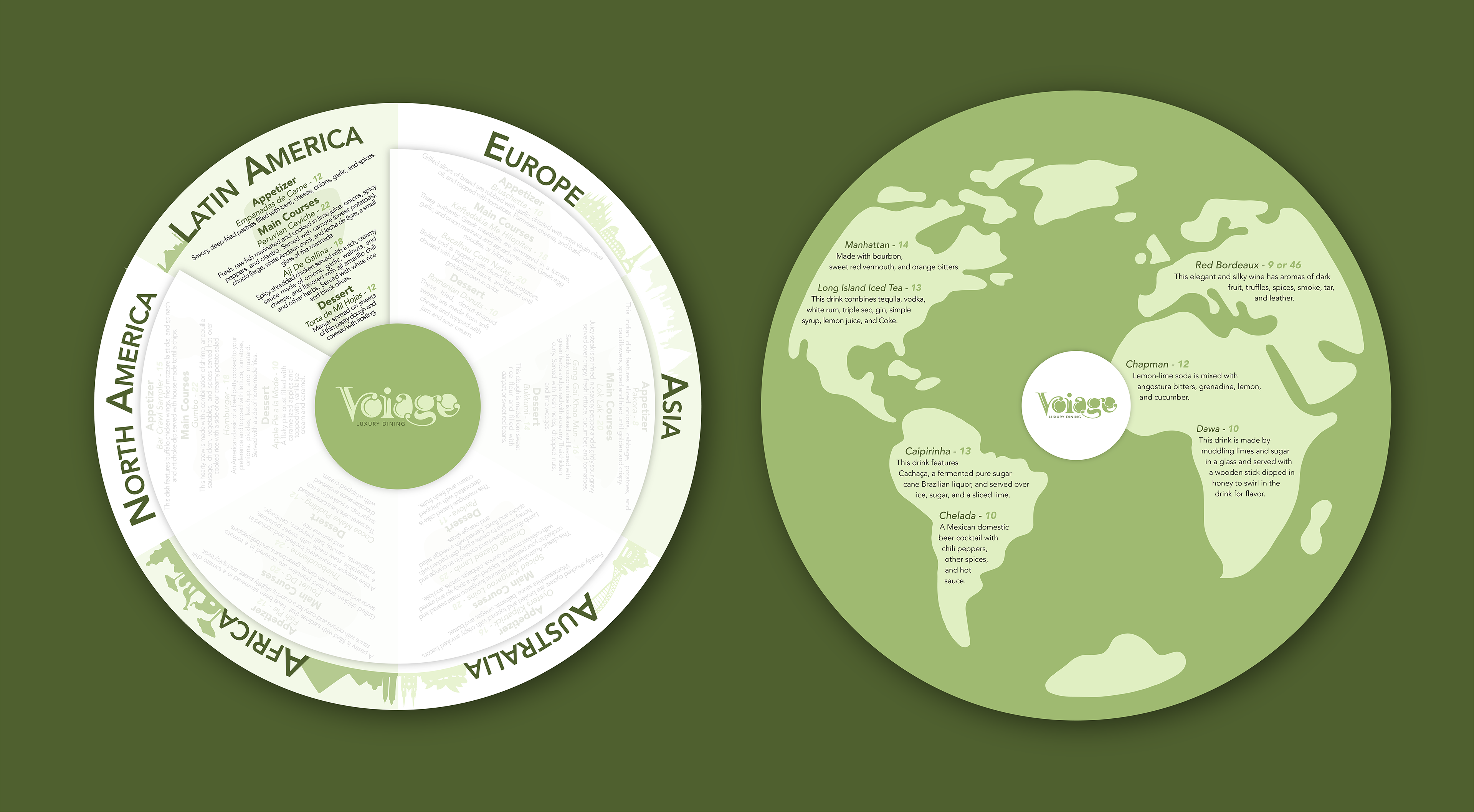
Our next step was to create a menu for our restaurant. My inspiration for its unique shape was a globe. I wanted the customers to feel like they were traveling as they looked through the menu, which I tried to replicate through the vellum top layer and the cutout, allowing them to see only a single continent's menu. I also did this to prevent the customer from feeling overwhelmed when looking at the different varieties of food. Along the border, I added recognizable skylines from each continent. I did this to add variation and interest to the design and alternated the colors to differentiate from the different continents. The second image is the backside of the menu, which lists the wine selection for this restaurant. Once again, I wanted to emphasize my inspiration for a globe, so I made the silhouette of the continents the background of the design.
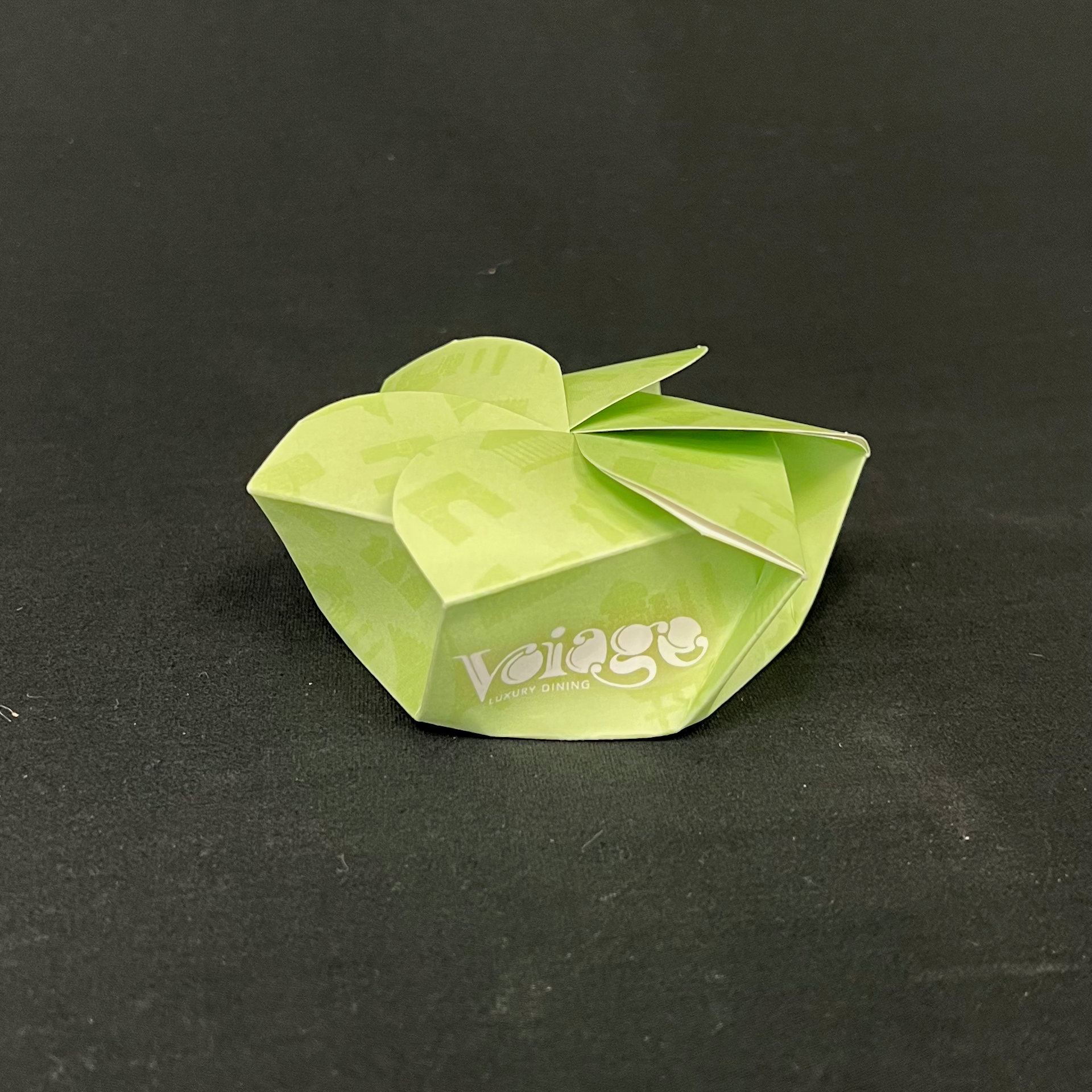
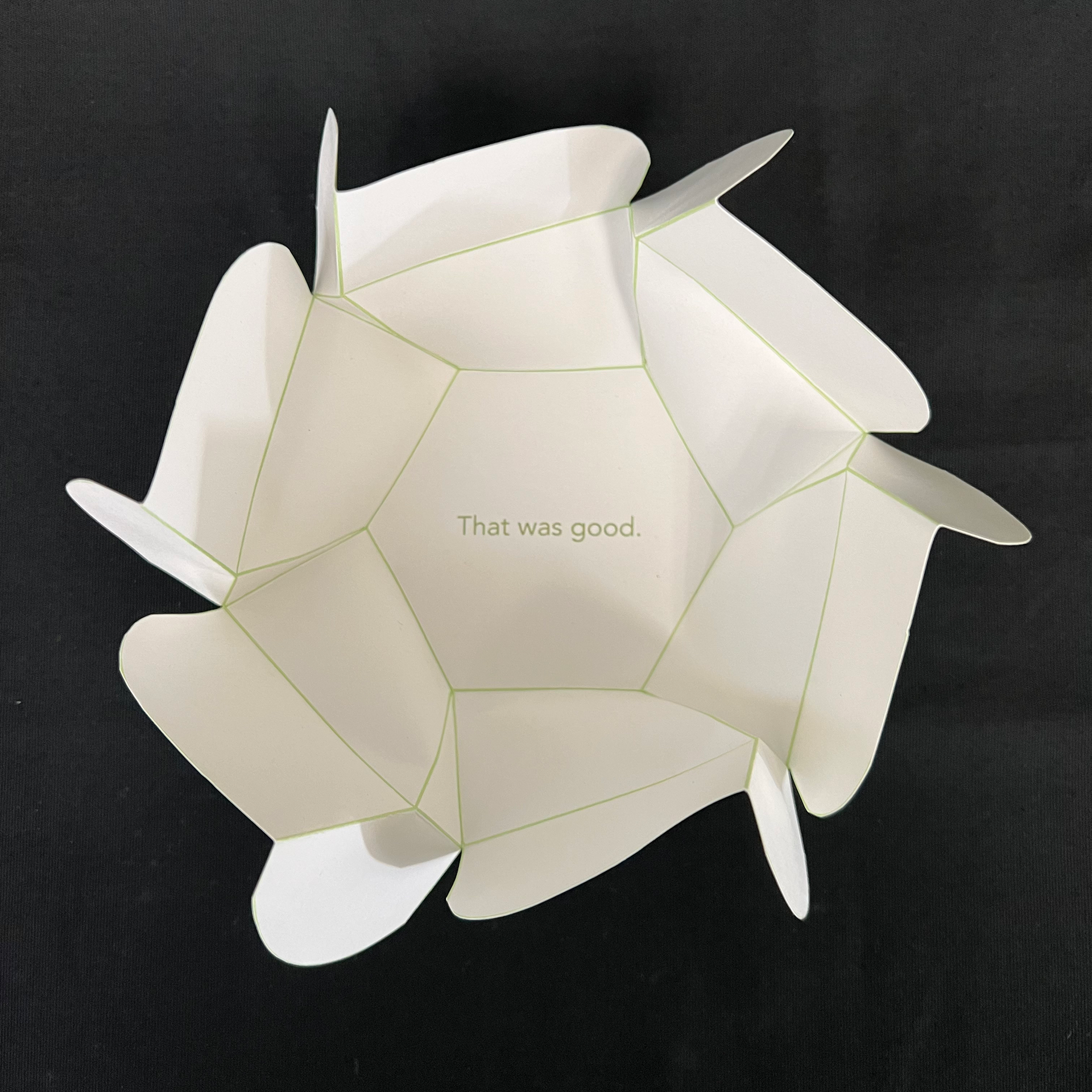
The next step of our restaurant branding journey was to create a to-go box. I wanted to create a unique box easily recognizable by its silhouette. After researching different to-go boxes online, I found one I wanted to replicate. I made it six-sided to represent the six continents featured in this restaurant. On the outside of the box, I referenced the letterhead system I had created for the restaurant earlier in the semester and used recognizable landmarks worldwide to create interest. It took several variations to work through some of the sizing issues, but I enjoyed the final version of my to-go box.
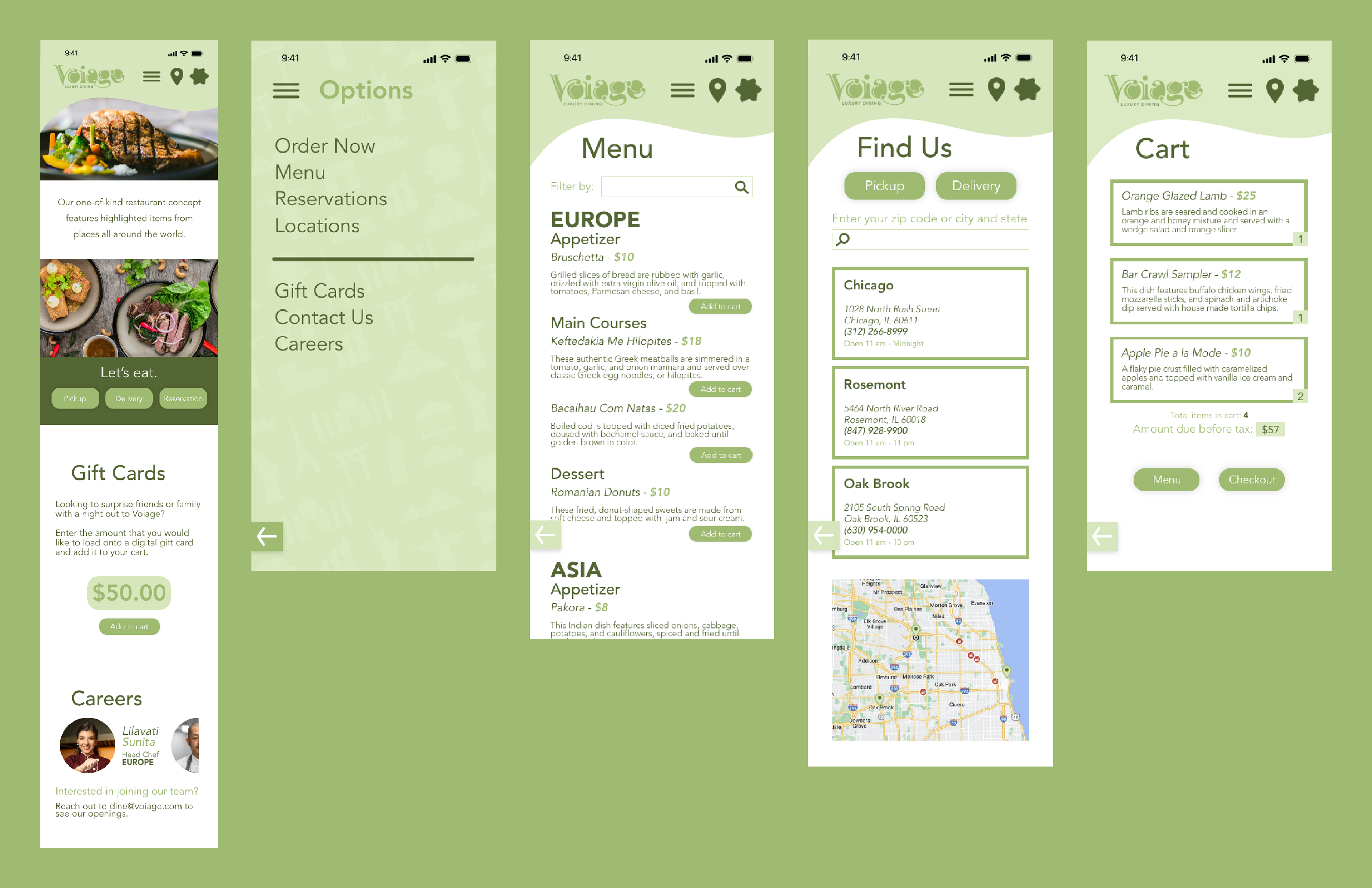
Our last task for this project was to create a mobile website for our restaurant. I wanted to carry the same organic shape that I used in the letterhead system inspired by the fluidity of the logo. I also wanted the website to feel clean and simple to use. I implemented several designs throughout the project, such as the silhouettes of different landmarks and the to-go box to act as the button to the cart. I used Adobe XD for this project; it was the first time I'd ever used this program. It was really interesting to work with the layout of this program and learn about all of the different features it has. It made designing a mobile website easy, and I would recommend it.
Throughout this semester-long project, I utilized Adobe Photoshop, Illustrator, XD, and InDesign to create this brand's identity. I created the brand's logo, stationery set, menu, takeout box, and mobile website. I enjoyed expanding upon the restaurant's logo and branching into the different areas a logo and the brand's assets can incorporate to create a consistent message.